Showing posts with label Photography tips. Show all posts

Friday, May 17, 2013

Hard to believe, but even a photo from your smartphone can look incredible


I usually don't do "shout outs" but when one is in order, I do. And one is definitely in order in this case.

The family all got together Mother's Day weekend to celebrate my mom's birthday and while sitting outside around the pool with the girls, the youngest of the group (my 10 week old niece) got propped up for her first "tummy time" outside by the pool. I only had my iPhone with me and not my "big gun" camera. I had to take advantage of the moment because the light was great and the subject adorable.

Once I was back home, I decided to try my hand at making the casual shots look like studio shots. I turned to my handy arsenal of tools comprised of:
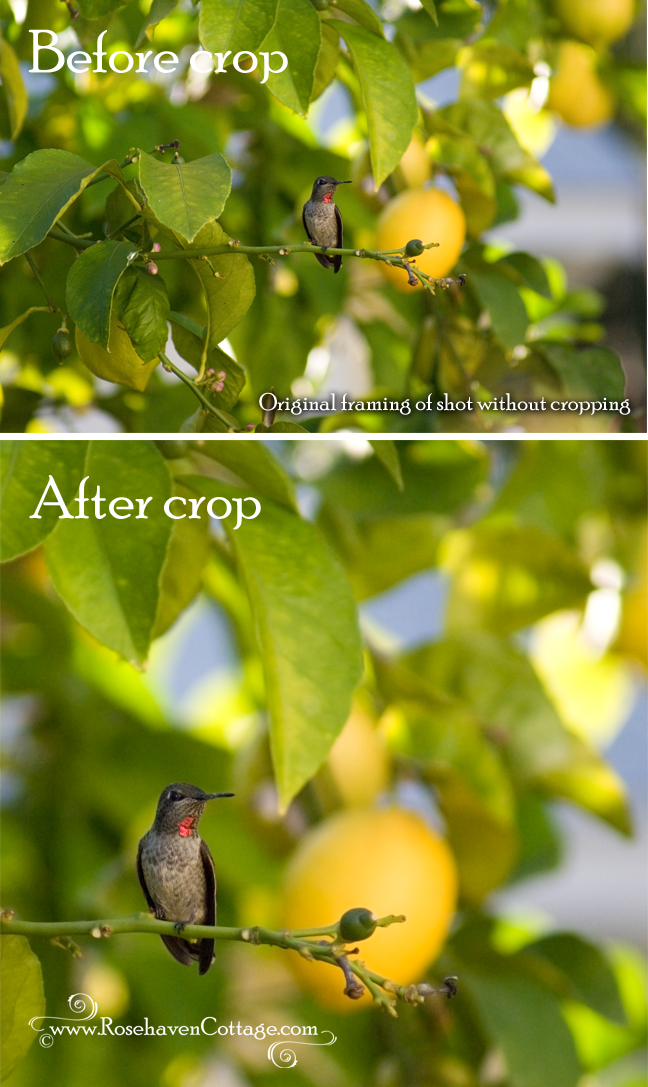
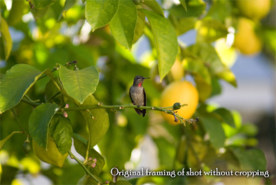
I cropped the shot and then started to work on getting rid of the icky background. I'm not a fan of masking in Photoshop because the edges often look unnatural. I prefer to step into the taboo world of "destructive editing" where I erase with a soft-edged brush all along the edge of the subject. Yes, I know... it's "wrong". But I always work on a duplicate layer and never the original so I'm covered. 


After I erased away the background, I added two of Kim Klassen's textures as layers underneath--"Life is Good" and "Isobel" (flipped over so the dark edge was down) from her Downton II Collection. I took each layer through a Gaussian blur filter so they looked like they were naturally blurred in the background of the photo. I reduced the opacity of the "Life is Good" layer to 30% and put it on top. Then on the "Isobel" layer, I painted in some shadows in a similar shade of blue as the "Isobel" texture with a soft brush set at 10% right along the edge of the pillow and the babies elbows.


With the background taken care of, I was able to focus on the subject and making sure she was in the best light possible. 

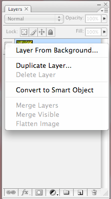
I saved my file first. Then I did "Save As..." and saved a copy of the file with a slightly different name. I worked off the  "Save As..." file from that point forward. I did this because in order to use Oh So Posh's PS actions (and most others) it is necessary to flatten the file which gets rid of all the layers. This is necessary because almost all actions look for a layer named "Background" to perform their "magic" on. When you flatten a file all the layers in that file are merged into one layer and that layer is automatically named "Background". I like to retain a copy of the file with all the layers in case I need to go back and perform more edits. 

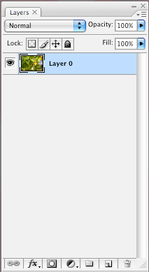
So... I flattened the "Save As..." copy of the file...


... and then started running the actions I've purchased and loaded in the past.


I ran four actions in total on this particular photo. Oh So Posh's actions allow you to tweak a great deal so I tweaked where necessary. I used: 

"Innocence" at 100% opacity
"Sheer Beauty" at 80% opacity
"Barely There" at 80% opacity
"Wispy Pink" at 75% opacity


I saved the file. 

Then I performed another "Save As..." so I could retain a copy of the layered file and work from a copy that I could flatten in order to work with the final actions "Lovely Eyes" and "Twinkle Eyes". I flattened the new copy of the file as before, and ran the two final actions.

And that's how I turned a casual shot taken with my iPhone into a shot that looks like I had my "big gun".


Happy creating and remember...
Pin It!

Thursday, August 25, 2011

Tutorial: Cropping a photo can make all the difference


Click on any image in this post to view larger


Cropping a photo can make all the difference

Since the increase in the popularity of recreating the look of vintage photos (e.g., Polaroids), the square cropped photo has increased in popularity as well. The square crop can really make a huge difference in a shot that would otherwise have less impact compositionally.

Here's a perfect example... I took the shot below with my zoom lens...

The sweet little female Anna's hummingbird is visible but kind of gets lost in the shot. I want her to be the star of the show though. So it's time to work some cropping "magic".

In Photoshop CS3 (my preference for cropping), I open the photo. It automatically opens the file as a flat image with no layers. I know this because in the layers control area it shows my photo as "Background" written in italics. That means that it's flat and I have limited editing capabilities with that layer.

So the first thing is to make the Background layer into a Layer by right-clicking on that background layer in the layer controls and selecting Layer from Background:


Now the photo layer will look like this in the layers controls:

At this point, I could simply use the cropping tool and crop the photo but I'd lose a lot of flexibility because the cropping tool "cuts" away all the data outside of the area selected by the cropping tool. I don't want that.
Instead of using the cropping tool, I go to the Image menu and select Canvas Size:
Understanding what a "canvas" is in Photoshop

This is very different than selecting Image Size. The "canvas" in a PS file is the work space on which your photo layer(s) resides. By changing the canvas size, it's like I'm defining what size table I'm using to work on a craft project. Changing the size of the table doesn't affect the materials sitting on the table, it just changes the size of the table. The same is true with the canvas size in Photoshop. Making a change here changes the work area (canvas) but not the size of photo layer(s) sitting on the work area (canvas). That's why I had to make the photo a layer first, so it sits independently on top of the canvas.

The original size of the canvas shows at the top of the window as "Current Size". I can change the size to anything I want in "New Size" area. Since I want a square crop on this photo I changed the width to be equal to the height at 10.8 inches:

When I click OK, a window always pops up that looks like this:

I'm fine with the new canvas size being smaller than the current canvas size (that's the point) so I click Proceed.

At this point, my image looks like this:

Sometimes this is all I need to do to make a composition work better. But in this case, it needs a bit more tweaking.

Why I prefer using Photoshop CS3 for cropping

Unlike later versions (CS4 and CS5), in PS CS3 there is a Navigator in the upper right-hand corner of the screen that looks like this:


Using the slider at the bottom of the Navigator I zoom out so I can see a significant amount of the grey space around the edges of my images.


This grey space is space that's off the edges of the canvas (remember the canvas is like your craft table).


Why is this important? While the photo layer is still selected in the layers controls, if I go to the Edit menu and select Free Transform (Command T is the keyboard shortcut for Macs)...

...I can see the edges of the original photo hanging off the sides of the canvas into the grey spaces!

Using the Free Transform function lets me move the photo around on the canvas area and try out lots of different "crops" without cutting anything.

Free Transform also lets me resize the photo layer independently of the canvas using the resizing boxes on the corners.
IMPORTANT TIP: To proportionally resize a photo ALWAYS hold down the Shift key and only pull on the resizing boxes in the corners. You will avoid a distorted photo this way. No more photos that look like they were taken in a carnival fun house.


With this photo, I want the hummingbird to be larger in the composition, so I hold down the Shift key and pull on the corner resizing boxes until the hummingbird as large as I want her in the composition. During this step, if I need more grey space to work in to pull the resizing boxes larger, I use the Navigator to zoom out so I see more grey space and a smaller version of the canvas.

Once I'm happy with the size, I hit the Enter key to finalize my changes and the grey outline and resizing boxes disappear. If I want to get them back to do more tweaking, I select Free Transform, and they come back.
With my photo layer still selected in the layers controls, I can now select the Move Tool at the top of my tools palette and drag the photo around on the canvas until I like the framing of the hummingbird on the canvas.
Notice that I don't put the hummingbird smack dab in the center of the compositions. Why? I roughly use the "Rule of Thirds" to position my subject on the canvas to create a visually interesting composition.


"The rule of thirds is a compositional rule of thumb in visual arts such as painting, photography and design. The rule states that an image should be imagined as divided into nine equal parts by two equally-spaced horizontal lines and two equally-spaced vertical lines, and that important compositional elements should be placed along these lines or their intersections. Proponents of the technique claim that aligning a subject with these points creates more tension, energy and interest in the composition than simply centering the subject would." Wikipedia
Notice that I said I "roughly" use this rule in my positioning. Sometimes it works and sometimes it doesn't. In the end it all depends on what looks good to me. If you like how it looks and it makes something inside you say, "Yes, that's it!" then that's all that matters.

Here's one final look at the before and after:

Cropping a photo can make all the difference

Now dive in and start creating but always remember...
Pin It!

Saturday, August 20, 2011

A mistake can really be "photographic serendipity" (and a quick lesson in color theory)

When you see an asterick (*) it means I've included a term
in the helpful glossary of photographic terminology definitions
Click on the word and you'll be taken to the glossary

Cure for the January blues

"Photographic serendipity" is a phrase I've coined to describe what happens when me and my camera are in the right place at the right time. It also describes the phenomenon of my camera capturing something that my natural eyes don't see. And the term also encompasses the instances when a photographic "mistake" actually yields something I like.

The latter is what happened when I shot the above photograph in winter 2009. I was out in the garden, enjoying a weird January heatwave and taking some shots of the few blossoms that were around. The orange and yellow gazanias (a native flower of South Africa that grows well here in the San Francisco Bay Area of California) were in bloom. Low to the ground and planted among rocks and other protectors, these stalwarts often bloom at odd times during the winter when everything else is dormant.

I was shooting the orange gazanias when I realized that I wanted to get some good "bokeh"* shots of the flowers. In order to create a shallow depth of field*, I switched my camera to a setting where the aperture* setting was dominant over everything else. Well, apparently in doing so, it also overrode any automatic white balance* adjustment my camera would perform which meant that since I was shooting in a slightly shady area of the garden, everything in the background behind the orange flower that was normally made up of greens and russet burgundy tones turned blue!


When I first looked at the photos in preview mode on the back of my camera, I thought, "Well, those are throw-away shots." Fortunately, I have learned to not delete shots in the camera and wait until I get them back to the computer to toss out rejects. When I got back to the computer and looked at the shot bigger on my computer monitor, I realized that the white balance* "problem" was actually "photographic serendipity".

The first thing that crossed my mind was that the orange gazania had a perfect backdrop of blue. The reason it is the perfect backdrop is that orange and blue are complementary colors.

A quick color theory lesson from my art school days

Every color has a perfect complementary color. Complementary color pairs are determined by the simple circular color wheel. Colors that are directly opposite each other on a circular color wheel are a complementary pair. In a very simple color wheel there are the following complementary pairs: orange and blue; red and green; yellow and violet.

Color wheel courtesy of St. Lawrence Place

The human eye likes looking at complementary colors together. Why? Because the human eye is the most comfortable when it can see the presence of all three primary colors (red, yellow and blue) in the same composition. The only way this happens when viewing just two colors is for one of the two colors to be a mixture of two primary colors. Orange is a mixture of red and yellow. Green is a mixture of blue and yellow. And violet is a mixture of blue and red. When one of these mixed colors is viewed with its perfect complement from the opposite side of a circular color wheel, the human eye just loves it and tells the brain, "Ahhhh... I like what I'm seeing right now. Everything is right with this picture."

Now back to my photograph

When I saw this "mistake" of a photograph up on the computer screen I realized that if I could brighten the oranges and deepen the blues, I could possibly have a really cool image on my hands because it was a perfect complementary color composition.

With the color adjustment features in Photoshop, I was able to pump up the orange tones from the original image that came straight out of the camera ("SOOC" is the acronym). But it also made the blues a little greener than the original, lessening the complementary color impact.


Then I got the idea that I should try using one of my Photoshop actions* on it.

I only have a few Photoshop actions in my arsenal. One is to make a photo look like it was shot with a Lomo camera*. I happen to have a few Lomo actions that were free downloads. So I used one of my Photoshop actions that fakes the "lomo effect", and then the image really popped with the blue deepening behind the relatively untouched brilliance of the orange.


As happens with a lot of my photographic work, if I stare at it too long I begin to doubt my own judgment. So I asked Hubby to come take a look. His reaction of "WOW! I think that is my favorite photograph you've done of all time!" was confirmation that I had done the right thing by following my instincts.

So next time you think you've got a "mistake" photograph on your hands, you might want to take a second or third look at it. You could actually have a perfect candidate for a bit of "photographic serendipity".

Happy creating and remember...

Pin It!

Use of content in digital or print form
is strictly forbidden without written consent
unless noted as a free download.
Just ask... I may say "yes".

celebrations.com Invites & eCards
//Pin it button