Showing posts with label Tutorials. Show all posts

Monday, September 2, 2013

Designing a handout that's economical on paper and reproduction costs but still looks great


This year, I was again given the choice privilege of creating the design for a handout to announce one of the thousands of worldwide gatherings of incredible women to watch the satellite broadcast of the General Relief Society Meeting of The Church of Jesus Christ of Latter-day Saints. It is such an honor to be a part of this organization of stellar women and then to be able to assist in some way is an honor I don't take for granted at all.

The design process for this particular flyer is always a fun challenge for me. In order to save resources and money there are some key limitations:
  1. The design is for a half-sheet of standard letter-sized paper so that two flyers can be made from one sheet of paper.
  2. The design needs to look great reproduced using a simple black and white photocopier. Color copies are pricey and printing hundreds of these on a color inkjet printer isn't economical.


I can't use color or photos as a crutch because neither would reproduce well when copied on a photocopier. Everything has to be black and white line art the way it used to be back when I was a graphic design student in college. Luckily, I now have the computer as my main design tool so the work goes much faster than back then.

I custom-built the lettering for the word "Feast" using vector tools. I incorporated a Victorian-style font for the words "Upon the Word". I created a black and white vector of the Relief Society logo. Then I added antique and vintage clip art from my Dover books to pull the eye through the design to all the key pieces of information the reader needs to see and know. I like how many of the design elements look like grapevines winding their way through the layout.

If you have to design a flyer with the same limitations here are some helpful tips:
  • Choose only black and white line art with clean definition. Stay away from photos or color graphics that will look like a smudgy mess when you photocopy the master.  
  • Don't use a lot of different fonts for the key information text like the date, time, location, and other important information. 
  • Be creative and playful with your font choices in the title instead of the body text. Treat the title like another piece of clip art and play with font size, choice, unusual placement, etc.
  • Find a key element in the theme and then play off that for your graphics choices. I keyed off the word "feast" and embellished with a bunch of wheat and grapes. You don't need to be super literal when you're choosing your clip art. Sometimes it's better not to be. 
  • You probably will rarely find everything you need in one piece of clip art. Don't get discouraged. Instead, mix and match laying one on top of another the way you would cut out pieces of paper on a scrapbook page. 
  • If you want really crisp lines that reproduce well, look for clip art that's in a "vector" format or .EPS format. That means it will resize to any size and still retain smooth edges that don't become jagged (pixelated).
  • When you're ready to hand off your final printing file to someone, save it as a .PDF file. That way all your hard work is safe from an accidental edit on the other end (e.g., someone hitting the delete button while something in the design is selected). It also ensures that the resolution will be beautiful when they print the master to be photocopied.
  • To add a little punch to the final handout, try photocopying it onto colored paper. Choosing a pale to medium shade colored paper will add an extra "pop" to the black and white design without making it hard to read (stay away from darker colors like red).
Fun facts
Did you know that the Relief Society is the oldest and largest women's organization in the world? Established in 1842 for women 18 years of age and older, the Relief Society is a philanthropic and educational women's organization that now has approximately 6 million member in over 170 countries and territories around the world. 


Pin It!

Thursday, August 22, 2013

Tutorial: Using a texture to make a photo look like a colored pencil drawing


Taking a close-up of fruit on a tree in direct light creates some pretty harsh shadows. But you can make that kind of photo work for you by turning it into a piece of art that looks like a colored pencil drawing.

Here's how I do it...

I open the photo in Photoshop. I use CS3 but this will also work in Photoshop Elements and other versions (you can also use this method in other software programs that allow you to work with layers).

When I open the photo in CS3, the photo is the first layer in the file (sometimes it's named "Background").

Using the "Place" command (under the "File" menu), I place a texture file as a new layer.


In this case, I placed my texture "Arroyo" from  The American West texture variety pack (available by clicking below).


When I first place the texture it may not be the same size as the photo.


I then resize the texture layer by pulling the resizing squares on each corner so it completely covers the photo layer underneath it. It ends up looking like this:


The next step is to make the texture layer slightly transparent so you can see the photo through it and get the effect of the texture overlaid onto with the original photo.

In this case, with the texture layer selected I went to the "Layers" menu (in CS3 you can see it in the right hand side of your workspace) and changed the opacity to 50%.


 It made the image look like this:


You can experiment by sliding the opacity up or down to find the right fit for your photo. Remember, nothing is permanent and you aren't changing the original photo at all.

I liked the 50% for this texture and photo pairing. It gave me enough texture to but let the details of the photo show through (this is why a photo with harsh shadows works really well with this technique).

At this point, I could actually leave the photo the way it is, save it, and I'm done. But I like to tweak things a bit more after this step by accentuating certain elements in the photograph that I can only determine by hand.

To do that, I first have to turn the texture layer from an uneditable "smart object" into something I can edit with all my Photoshop tools (if you're using a different program that let you place the texture as an editable object on top of the photo then you don't have to do this step). So I rasterize the texture layer by right clicking on the texture layer in my Layers panel.


Then, I select the eraser tool:


I set the opacity of the eraser to 5-10%:


I choose a soft-edged brush at about 100 (this will depend on the size of your photo and you will probably change the size of the brush a couple of times as you edit):


Then with the texture layer selected, I start strategically erasing certain shadows around the center of the bottom of the apple to bring out the details of. I use a digital tablet and stylus so it feels like I'm "drawing", but you can do the same thing with your mouse. Gentle strokes from the darkest shadows out toward the lighter areas mimic brush or pencil strokes. With the opacity set very low I only take away a little at bit at a time and feather out from the darker shadows.

 I only erase just a little here and there to draw out some of the detail in the focal points of the photo. The reason I'm doing this is I'm mimicking how colored pencil would look on paper. The areas with shadows would get more colored pencil on them so the paper wouldn't show through as much as the lighter areas that barely have any colored pencil on them. For areas of really white highlights where you'd use a white pencil to define them if you were drawing, the same holds true because the white pencil would mask the texture of the paper.

I erase more in the deepest shadows and the lightest highlights until I get it to look exactly how I want:


As always don't hesitate to ask me questions in your comments.
I will do my best to answer them here as a reply comment 
or privately if you have an email address connected to your comment.

Happy creating and remember...
Pin It!

Friday, May 17, 2013

Hard to believe, but even a photo from your smartphone can look incredible


I usually don't do "shout outs" but when one is in order, I do. And one is definitely in order in this case.

The family all got together Mother's Day weekend to celebrate my mom's birthday and while sitting outside around the pool with the girls, the youngest of the group (my 10 week old niece) got propped up for her first "tummy time" outside by the pool. I only had my iPhone with me and not my "big gun" camera. I had to take advantage of the moment because the light was great and the subject adorable.

Once I was back home, I decided to try my hand at making the casual shots look like studio shots. I turned to my handy arsenal of tools comprised of:
I cropped the shot and then started to work on getting rid of the icky background. I'm not a fan of masking in Photoshop because the edges often look unnatural. I prefer to step into the taboo world of "destructive editing" where I erase with a soft-edged brush all along the edge of the subject. Yes, I know... it's "wrong". But I always work on a duplicate layer and never the original so I'm covered. 


After I erased away the background, I added two of Kim Klassen's textures as layers underneath--"Life is Good" and "Isobel" (flipped over so the dark edge was down) from her Downton II Collection. I took each layer through a Gaussian blur filter so they looked like they were naturally blurred in the background of the photo. I reduced the opacity of the "Life is Good" layer to 30% and put it on top. Then on the "Isobel" layer, I painted in some shadows in a similar shade of blue as the "Isobel" texture with a soft brush set at 10% right along the edge of the pillow and the babies elbows.


With the background taken care of, I was able to focus on the subject and making sure she was in the best light possible. 

I saved my file first. Then I did "Save As..." and saved a copy of the file with a slightly different name. I worked off the  "Save As..." file from that point forward. I did this because in order to use Oh So Posh's PS actions (and most others) it is necessary to flatten the file which gets rid of all the layers. This is necessary because almost all actions look for a layer named "Background" to perform their "magic" on. When you flatten a file all the layers in that file are merged into one layer and that layer is automatically named "Background". I like to retain a copy of the file with all the layers in case I need to go back and perform more edits. 

So... I flattened the "Save As..." copy of the file...


... and then started running the actions I've purchased and loaded in the past.


I ran four actions in total on this particular photo. Oh So Posh's actions allow you to tweak a great deal so I tweaked where necessary. I used: 

"Innocence" at 100% opacity
"Sheer Beauty" at 80% opacity
"Barely There" at 80% opacity
"Wispy Pink" at 75% opacity


I saved the file. 

Then I performed another "Save As..." so I could retain a copy of the layered file and work from a copy that I could flatten in order to work with the final actions "Lovely Eyes" and "Twinkle Eyes". I flattened the new copy of the file as before, and ran the two final actions.

And that's how I turned a casual shot taken with my iPhone into a shot that looks like I had my "big gun".


Happy creating and remember...
Pin It!

Friday, May 10, 2013

Take a plain cube vase and make it special for Mother's Day


Simple cube vases are quite inexpensive and a great staple to have around for floral arrangements. But what if you want to dress one up for a special occasion or holiday?

I dug into my stash of scrapbooking paper and paper punches and constructed this fun solution following these simple steps:

  1. I cut out four frames from a pretty colored card stock that would coordinate with the flowers that would be in the vase. For mine, I used a Sizzix Bigz die cutting frame (654446), but it isn't essential to use that equipment to achieve the same effect. You can even cut out the frames with scissors.
  2. I taped each of the frames end-to-end on the back with scotch tape.
  3. I taped together the ends of the end-to-end chain of frames to form a "box" of frames that slides nicely over the top of the cube vase.
  4. To embellish one of the frames for the front of the arrangement, I took one of the centers that had been cut out of one of the frames and used my other paper cutting equipment to make fancy corners. You can do those by hand with scissors too. I just happen to have some fun hand-punches.
  5. I cut out a smaller square out of white paper and embellished it with fancy paper punches then tape it on the front of the purple square using double-sided adhesive tape.
  6. I found a decorative font on my computer (I used "Romantiques" that's a free download at www.dafont.com
  7. In a simple MSWord document (any word processing software works), I typed out the word "Mother" in the font type I chose and made it a pretty shade of purple.
  8. I printed out the type onto purple paper using my inkjet printer.
  9. Using scissors, I freehand cut around the shapes of the letters without getting too close to the printing.
  10. I stuck adhesive pearl embellishments I had in my stash (I got mine at the craft store) on each letter (the wider letters got more than one pearl).
  11. I stuck a couple evenly spaced foam adhesive squares (also from the craft store) on the back of the "mother" cut-out and stuck it to the front of the glued squares at an angle.
  12. I stuck foam adhesive squares to the back of each corner of the whole front decoration and stuck it on the vase sleeve frame at an angle.
  13. For an added touch, I hot-glued simple pearl beading trim in little swags around the top edge of the vase sleeve.
  14. At the apex of each swag of pearl trim, I hot-glued a single tiny silk flower pulled from its stem (I got a whole sprig at the dollar store).
  15. As an added touch, after I placed the flowers in the center of the vase (using a floral frog is great for getting the look I got) I filled the vase with white liquid marbles and added submersible LED lights to make it glow from the inside.

Voila! I created a removable sleeve vase to doll up the plain glass cube vase for a special occasion. What's great is, I can do the same thing for other holidays and seasons and use the same vase over and over.


Happy creating and remember...
Pin It!

Tuesday, January 1, 2013

Friday, July 27, 2012

Tutorial: How to make a rose lantern

Photobucket

Happy creating and remember...
Pin It!

Wednesday, April 25, 2012

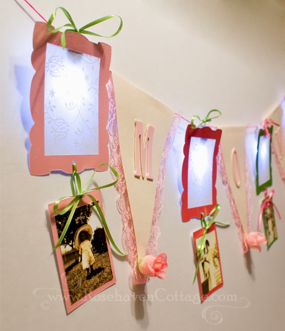
Craft idea: Lighted decorative "Mom" banner for Mother's Day


When I make paper crafts I try to use every bit of the fancy paper I've purchased. With that philosophy floating in the back of my mind, this craft idea was born.

I bought all the supplies at my local craft store--mostly in the fancy paper area. I bought a sheet each of some heavy glittery card-stock in pink, hot pink and lime green as well as a sheet of translucent paper with a printed floral pattern on it. Because I don't have die-cut equipment for cutting out letters, I found a set of pink cardboard letters (and they were on sale too).

Then I headed to the ribbon section to find some coordinating ribbon in lime green and some cording in hot pink. I also picked up some flat pink lace in the inexpensive lace section of the store.

I went to the dollar store for a sprig of small pink roses. The dollar store is the best place for cheap "silk" flowers that don't need to be look realistic and are perfect for hot glue crafting. But I also could have gotten those at the craft store and just paid a bit more.

I already had some small self-contained LED lights (the kind you can submerse in water for floral arrangements) that had clips on the backs. Any LED light from the craft store will work. The clips on the backs of these made it easier for hanging on the cord once I was done. But you could hot glue hanging ribbon to any LED light you use.


Once I gathered all my supplies, I used the Sizzix Bigz Die 654711 frame (Decorative Rectangle) to cut the frames. I had the Sizzix because of some promo pieces I was working on for them, but any frames will work (even ones cut freehand). I cut the translucent paper slightly larger than the opening in the frames and glued it and the LED light to the back of each frame.

The die-cut left a rectangle of paper that was cut from the middle, so I used that to mount old family photos I'd printed on my inkjet printer on glossy photo paper. 

Using a small hole punch, I punched a hole in the horizontal center of the top of the mounting paper and a hole in the horizontal center of the bottom of the frame. I threaded the tiny ribbon through and tied off a simple bow to hang the photo from the bottom of the frame.

I hot glued the lace and letters onto triangles I cut out of simple cream colored cardstock. I left about a 5/8 inch edge side opposite the point of each triangle to fold over the cording once I was done. 

I pulled the pink rosebuds from the bunch from the dollar store and hot glued one on the point of each triangle.

Finally, I tied ribbons on the top of each LED light clip and folded over the tops of each triangle, folding over the 5/8" edge and gluing the fold to the back with double-sided adhesive tape.

As shown, the banner spans 3.5 feet. If you choose to spell out "Mother" instead of "Mom" you can make yours even wider.


Happy creating and remember...
Pin It!

Monday, January 16, 2012

Craft Tutorial: Bride and Bridesmaid Shower Centerpieces


Figures pictured above stand almost 12 inches tall
(finished size depends on size of bottles used)

Make one of these for each table to match the bride and bridesmaids in the wedding party. Then give them away as take-home gifts to the bridesmaids after the shower is over.

Materials needed for each figure:
  • Plastic bottle (I used a fancy shaped squirt bottle from the dollar store)
  • Wide fringe or lace trim
  • Two white pipe cleaners
  • One "silk" rose with stem removed (the dollar store is great for this too)
  • Wide grosgrain (bridesmaid) or satin ribbon (bride)
  • Small silk roses or other flowers for bouquet and headpiece (removed from stem)
  • Small square of tulle (for the bride)
  • Pearl accent trim (for the bride)
  • Hot glue and glue gun
  • Optional LED floral lights (any kind at a craft store)
  • Liquid or glass marbles, sand, beads or anything decorative to fill the bottle


Next, download the face and head backs PDF below


Click here to download the free PDF file with the faces for you to color
  • Print the discs on heavy cardstock (WalMart has inexpensive cardstock that runs great through just about any printer)
  • Color each face with the desired skin tone and hair color
  • Color head back disc below each face with the same color as the hair color on the face above
  • Cut out each of the colored discs


If you aren't making lighted centerpieces than hot glue the face disc and head back disc (blank sides together) with the end of the pipe cleaner sandwiched in the middle.

Now add final embellishments like the tulle veil on the bride, flowers as headpieces and/or pearl trim on the veil and edge of base trim.


Happy creating and remember...
Pin It!

Wednesday, November 30, 2011

Craft Tutorial: Lighted Snowman Party Favor

Lighted Snowman Party Favor

Happy creating and remember...
Pin It!

Thursday, August 25, 2011

Tutorial: Cropping a photo can make all the difference


Click on any image in this post to view larger


Cropping a photo can make all the difference

Since the increase in the popularity of recreating the look of vintage photos (e.g., Polaroids), the square cropped photo has increased in popularity as well. The square crop can really make a huge difference in a shot that would otherwise have less impact compositionally.

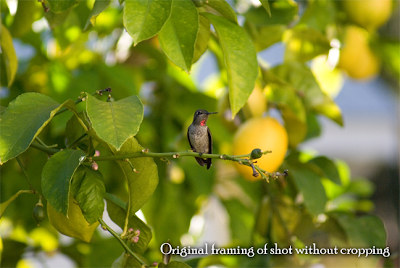
Here's a perfect example... I took the shot below with my zoom lens...

The sweet little female Anna's hummingbird is visible but kind of gets lost in the shot. I want her to be the star of the show though. So it's time to work some cropping "magic".

In Photoshop CS3 (my preference for cropping), I open the photo. It automatically opens the file as a flat image with no layers. I know this because in the layers control area it shows my photo as "Background" written in italics. That means that it's flat and I have limited editing capabilities with that layer.

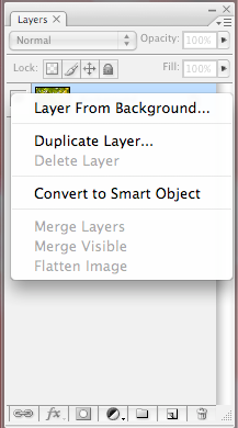
So the first thing is to make the Background layer into a Layer by right-clicking on that background layer in the layer controls and selecting Layer from Background:


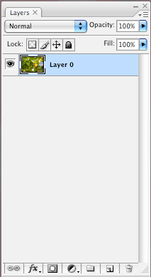
Now the photo layer will look like this in the layers controls:

At this point, I could simply use the cropping tool and crop the photo but I'd lose a lot of flexibility because the cropping tool "cuts" away all the data outside of the area selected by the cropping tool. I don't want that.
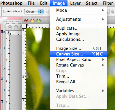
Instead of using the cropping tool, I go to the Image menu and select Canvas Size:
Understanding what a "canvas" is in Photoshop

This is very different than selecting Image Size. The "canvas" in a PS file is the work space on which your photo layer(s) resides. By changing the canvas size, it's like I'm defining what size table I'm using to work on a craft project. Changing the size of the table doesn't affect the materials sitting on the table, it just changes the size of the table. The same is true with the canvas size in Photoshop. Making a change here changes the work area (canvas) but not the size of photo layer(s) sitting on the work area (canvas). That's why I had to make the photo a layer first, so it sits independently on top of the canvas.

The original size of the canvas shows at the top of the window as "Current Size". I can change the size to anything I want in "New Size" area. Since I want a square crop on this photo I changed the width to be equal to the height at 10.8 inches:

When I click OK, a window always pops up that looks like this:

I'm fine with the new canvas size being smaller than the current canvas size (that's the point) so I click Proceed.

At this point, my image looks like this:

Sometimes this is all I need to do to make a composition work better. But in this case, it needs a bit more tweaking.

Why I prefer using Photoshop CS3 for cropping

Unlike later versions (CS4 and CS5), in PS CS3 there is a Navigator in the upper right-hand corner of the screen that looks like this:


Using the slider at the bottom of the Navigator I zoom out so I can see a significant amount of the grey space around the edges of my images.


This grey space is space that's off the edges of the canvas (remember the canvas is like your craft table).


Why is this important? While the photo layer is still selected in the layers controls, if I go to the Edit menu and select Free Transform (Command T is the keyboard shortcut for Macs)...

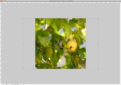
...I can see the edges of the original photo hanging off the sides of the canvas into the grey spaces!

Using the Free Transform function lets me move the photo around on the canvas area and try out lots of different "crops" without cutting anything.

Free Transform also lets me resize the photo layer independently of the canvas using the resizing boxes on the corners.
IMPORTANT TIP: To proportionally resize a photo ALWAYS hold down the Shift key and only pull on the resizing boxes in the corners. You will avoid a distorted photo this way. No more photos that look like they were taken in a carnival fun house.


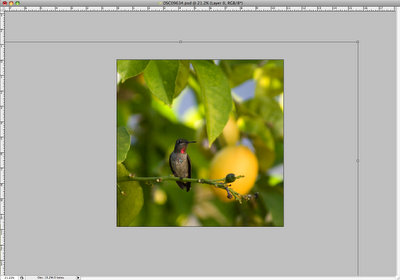
With this photo, I want the hummingbird to be larger in the composition, so I hold down the Shift key and pull on the corner resizing boxes until the hummingbird as large as I want her in the composition. During this step, if I need more grey space to work in to pull the resizing boxes larger, I use the Navigator to zoom out so I see more grey space and a smaller version of the canvas.

Once I'm happy with the size, I hit the Enter key to finalize my changes and the grey outline and resizing boxes disappear. If I want to get them back to do more tweaking, I select Free Transform, and they come back.
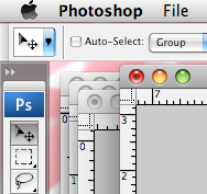
With my photo layer still selected in the layers controls, I can now select the Move Tool at the top of my tools palette and drag the photo around on the canvas until I like the framing of the hummingbird on the canvas.
Notice that I don't put the hummingbird smack dab in the center of the compositions. Why? I roughly use the "Rule of Thirds" to position my subject on the canvas to create a visually interesting composition.


"The rule of thirds is a compositional rule of thumb in visual arts such as painting, photography and design. The rule states that an image should be imagined as divided into nine equal parts by two equally-spaced horizontal lines and two equally-spaced vertical lines, and that important compositional elements should be placed along these lines or their intersections. Proponents of the technique claim that aligning a subject with these points creates more tension, energy and interest in the composition than simply centering the subject would." Wikipedia
Notice that I said I "roughly" use this rule in my positioning. Sometimes it works and sometimes it doesn't. In the end it all depends on what looks good to me. If you like how it looks and it makes something inside you say, "Yes, that's it!" then that's all that matters.

Here's one final look at the before and after:

Cropping a photo can make all the difference

Now dive in and start creating but always remember...
Pin It!

Use of content in digital or print form
is strictly forbidden without written consent
unless noted as a free download.
Just ask... I may say "yes".

celebrations.com Invites & eCards
//Pin it button